hello@caidence.systems Gold Coast QLD · Northern Rivers NSW
Never miss a beat. A Cyberry Software company ↗
Home/Recent work/CMA Charity Golf Day

Case study · Event guides

A charity golf day, run from a clubhouse kiosk and an app in every pocket.

Twenty-nine teams, eighteen holes, one shotgun start and a golf course with average wifi. We built the event guide twice out of one codebase — a portrait touch kiosk that lives in the clubhouse, and an installable phone app players carry around the course. Both keep working with the signal switched off.

Event
CMA Charity Golf Day 2026
Venue
Coolangatta & Tweed Heads Golf Club, West Course
Raising for
White Ribbon Australia
What we built
Touch kiosk + installable phone app (PWA)
Live
cmagolf.caidence.systems
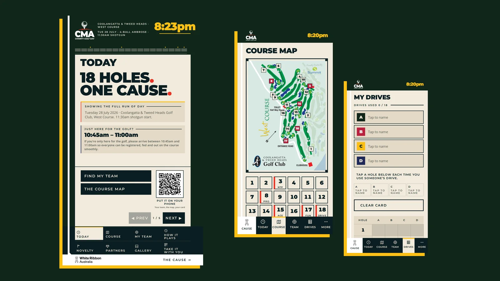
The CMA Charity Golf Day event guide shown as a portrait clubhouse kiosk beside two phone screens — the run of day, the course map and the tee-shot card
2
form factors, one codebase
9
sections in the guide
108
files cached for offline use
0
dependencies, build steps, network calls
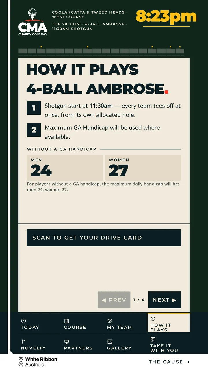
The kiosk's How it plays screen — the 4-ball Ambrose format, the shotgun start, handicap maximums and the three-drives rule set out as a numbered list
The brief

Everything a player needs to know was on one printed sheet.

A charity golf day is a lot of information delivered once, at ten in the morning, to people who then scatter across eighteen holes for four and a half hours.

The run of day. The Ambrose format and the three-drives-each rule. Which hole is nearest-the-pin, which one is beat-the-pro, and where the hole-in-one prize sits. Who's in your team and which tee you start on. Nineteen hole sponsors who paid to be seen. And the cause the whole day exists for.

On the day that's a printed sheet, a whiteboard, and organisers answering the same six questions right up until the shotgun goes. Our brief was to put all of it on a screen in the clubhouse — and in the players' hands.

What we built

Two form factors, one codebase — and they behave differently on purpose.

The same nine sections, the same data file, the same design. What changes is everything about how a standing adult uses a wall panel versus how a golfer uses a phone in one hand on a fairway.

In the clubhouse

The touch kiosk

  • A portrait 1080×1920 panel, standing where players register
  • Nothing scrolls. Content is paged with a stepper, because a scroll area high on a screen taller than a person can't be reached by the person using it
  • Every control sits in the reach zone, in a fixed shelf that never moves between screens
  • Its own on-screen keyboard — a kiosk should never raise the device's keyboard
  • An idle attract reel that cycles all nineteen hole sponsors while nobody's touching it
  • Swipe drives whatever's in front of you — and every swipe has a button too
On the course

The phone app

  • An installable app — add to home screen, its own icon, opens full-screen with no browser bar
  • No app store, no download, no login — scan the QR on the kiosk and it's on your phone
  • One scrolling document with the phone's own keyboard, because that's what a thumb expects
  • Six fixed nav buttons — an earlier scrolling nav bar fought every tap, so it went
  • No attract mode, and permanent chrome kept to a thin top bar and a nav bar
  • Keeps working out on the course, where reception drops and nobody can fix it

The kiosk's job is to inform, then hand over. The phone's job is to come with you.

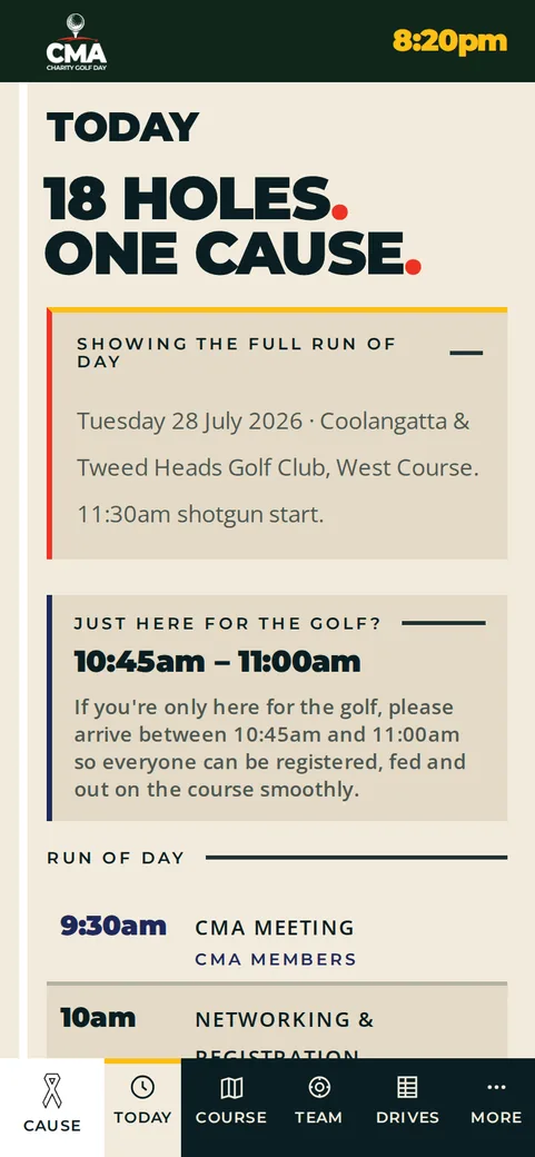
The phone app's Today screen showing the run of day
TodayThe run of day, live.
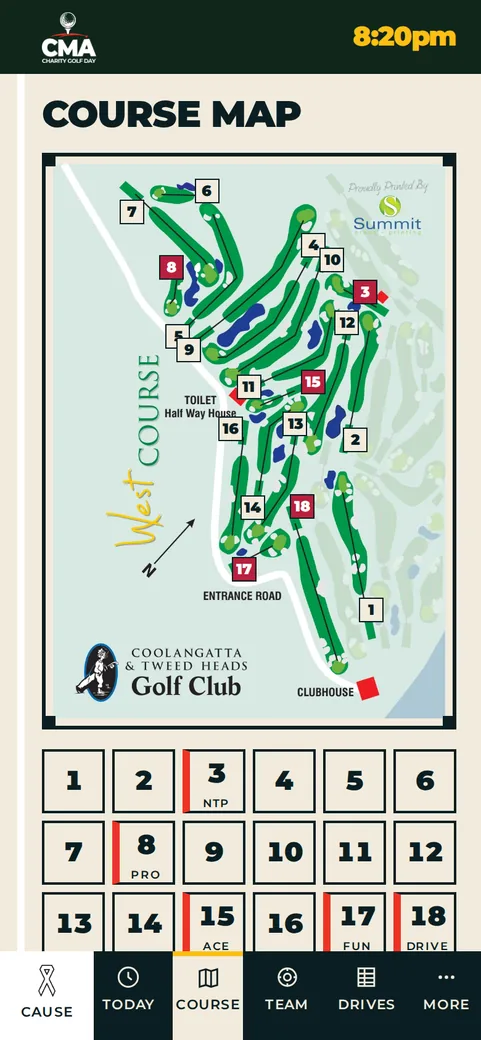
The phone app's course map with all eighteen holes and a hole chip rail
Course mapEvery hole, one tap.
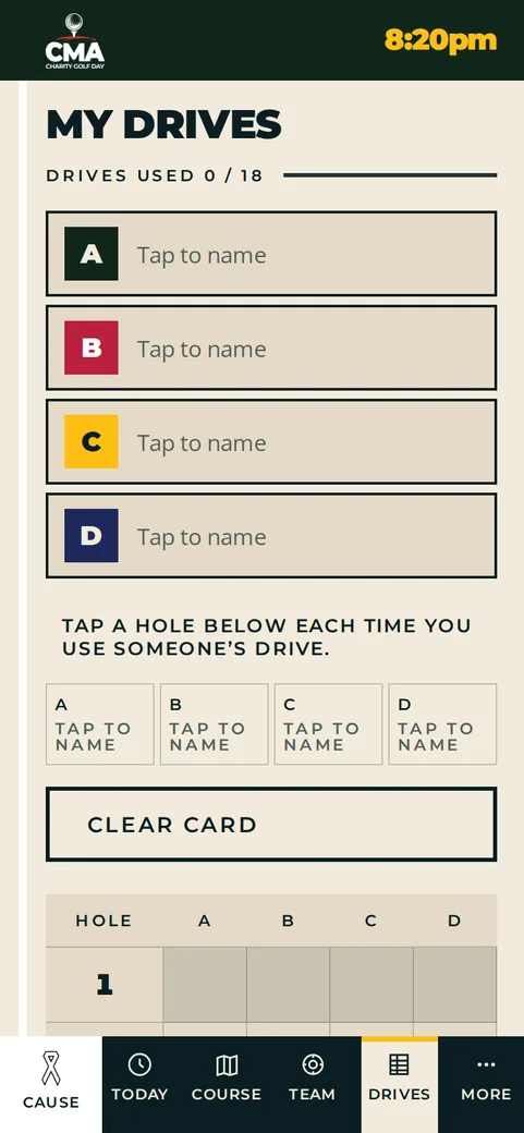
The phone app's tee-shot card with four named players and a per-hole grid
My drivesSaved on your phone.
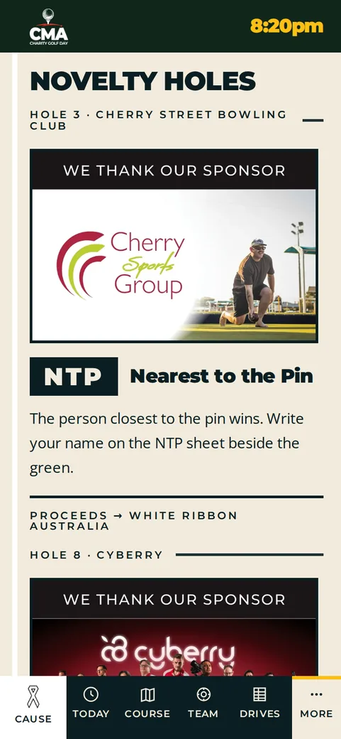
The phone app's novelty holes screen listing the day's challenges
Novelty holesThe five challenges.
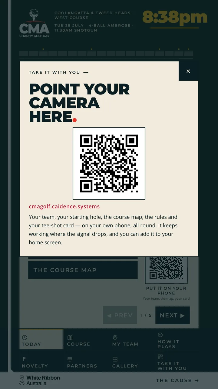
The kiosk's Take it with you screen — point your camera here, a large QR code, and a line explaining that your team, your hole, the map and your tee-shot card come with you on your phone
The detail we're proudest of

A shared kiosk must never hold one team's card.

Four-ball Ambrose with a three-drives-each rule means somebody has to keep count for four and a half hours. That job belongs on the phone, not on the wall.

The tee-shot card takes four names and one tick per hole. Tapping a different player moves that hole's drive rather than adding a second one, so a card that doesn't add up is impossible. Every logged hole also fills its tick in the header rail — the strip of chrome you ignored all afternoon quietly becomes your card at a glance. It saves to the phone, so it's still right at the fourteenth.

So the kiosk doesn't offer the card at all. Where it would have sat, the kiosk's eighth tile says take it with you — point your camera here — and the QR moves the whole guide onto your phone. Nothing is stored on the kiosk, which means the next group up always finds a clean screen instead of a stranger's four names and six logged drives.

That's the difference between shipping the same page twice and building one idea for two contexts.

Nine screens

Every question a player asks on the day, answered on the screen in front of them.

Today

The full run of day, the arrival window, the buy-ins to decide at registration, and where to go next.

Course map

The club's own printed West Course sheet, uncropped, with all eighteen holes tappable for the sponsor, par and any challenge.

Find my team

Three ways in: a tee grid, an A–Z rail, and typing. Search by name, club or hole number.

My drives

The three-drives-each rule as a ruled Ambrose card, ticked hole by hole. Phone only — the kiosk hands it over by QR instead.

How it plays

Format, handicap maximums, the drive rule, pace of play and etiquette — the rules sheet, without the folding.

Novelty holes

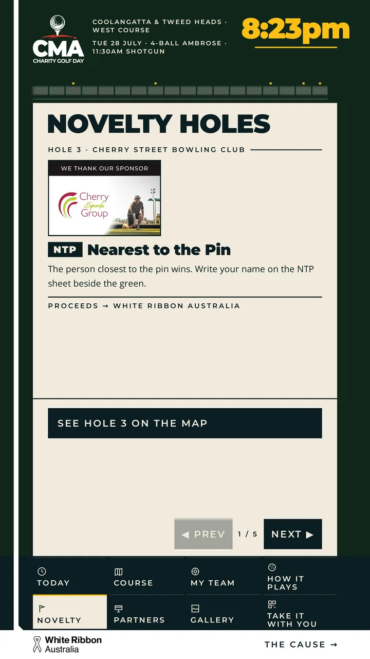
The five challenges and the hole-in-one prize, each ending in where the money goes.

Partners

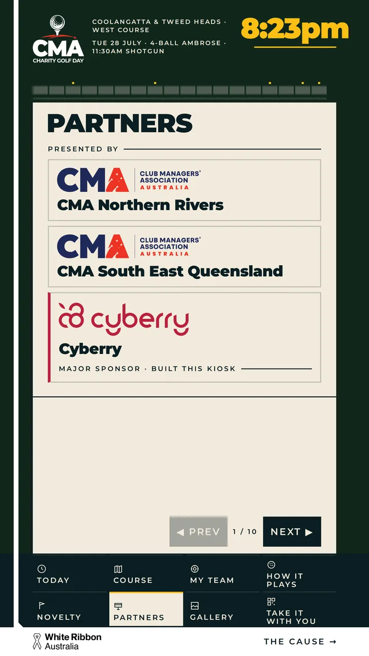
Presenting partners, organisers, all nineteen hole sponsors from their own print artwork, and supporting businesses.

Gallery

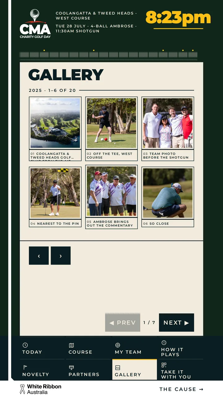
Last year's day at the same club — full-frame, tappable, and cached so it never waits on the wifi.

The cause

White Ribbon Australia, and the raffle ask. The one screen built to look nothing like the other eight.

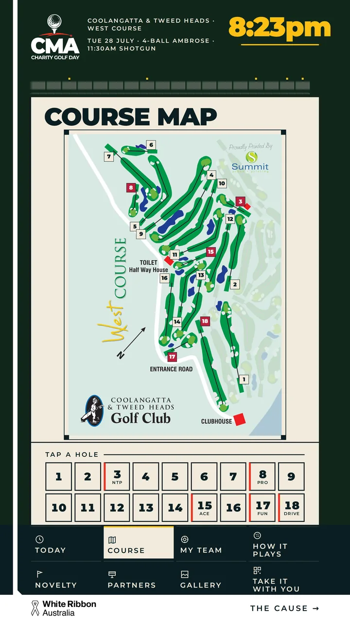
The kiosk course map — the club's printed West Course sheet with numbered plates on every tee and an eighteen-hole chip rail below
Course mapMarkers sit on the real tees.
The kiosk novelty holes screen listing the day's challenges
Novelty holesEvery block ends in the cause.
The kiosk partners screen showing presenting partners and hole sponsors
PartnersNineteen hole sponsors, all day.
The kiosk gallery screen showing photographs from last year's charity golf day at the same club
GalleryLast year, at the same club.

The map is a real map

We used the club's own printed course sheet rather than redrawing it, credit and all, so it matches the paper in the buggy. The eighteen numbered plates were measured against the map's own centre lines and sit on the tees to within half a percent. There's no pinch, no zoom and no pan — a map that can be dragged is a map the next player finds in the wrong place — so a chip rail underneath is a second, complete path to every hole.

"No match" is a real answer

Team search normalises apostrophes and hyphens so O'Connor and Nixon-Smith both land, reads a bare number as a hole and "12a" as a tee. And because a team sheet on the morning of an event is never complete, a miss is designed as a first-class state with a way forward — not an error message a player reads as "you're not in this".

Under the hood

Built for a clubhouse wall, not for a demo.

A screen in a venue is judged on the one morning it has to work. Most of the engineering went into the things nobody notices unless they fail.

Offline before the day starts

The shell, fonts, map and logos are cached the moment it's opened; then it quietly warms the remaining assets — every sponsor sign and every photo, 108 files — two at a time, with progress in the header. Cached copies answer instantly and refresh behind you, so a load never waits on venue wifi. We verified it by cutting the network and walking every screen.

Any portrait panel

Designed at 1080×1920 and verified filling the screen exactly at 810×1440, 1440×2560 and 4K 2160×3840 — so it fits whatever panel the venue already owns. Each screen measures itself against the space available and scales to fit, which means nothing is ever cropped or hidden behind a control.

Nothing to break

Vanilla HTML, CSS and JavaScript. No framework, no build step, no third-party scripts, and no network calls at all — the fonts, photography, logos, QR code and course map are all served from the one place. Nothing on the day depends on somebody else's uptime.

Written for the hardware that's there

Old Android panels are a fact of venue life, so the code deliberately avoids modern JavaScript syntax an older browser engine would choke on. The kiosk doesn't need new hardware to be reliable.

Contrast measured, not eyeballed

Every text and background pair that shipped was tested against WCAG AA rather than approved by eye. Getting there meant lifting our muted-text setting until it genuinely cleared the threshold — the sort of change you only make if you measure.

Privacy by omission

The published event data carries no email addresses, phone numbers or sponsorship figures, even though all of it existed in the source spreadsheets. One sponsor's sign was cropped before it went up, because the print artwork included two people's mobile numbers.

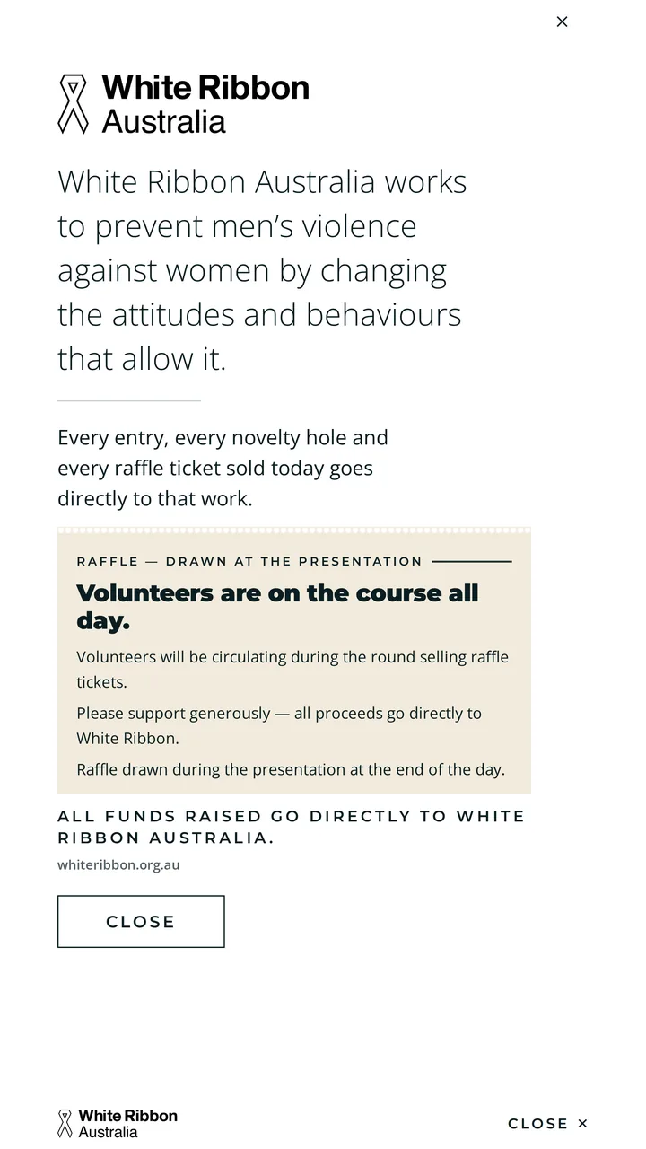
The cause screen — White Ribbon Australia on plain white with a single rule, no photography, no colour and no clock
Design

The day is loud and printed. The cause is silent and blank.

The look came out of the physical objects of a border-club charity golf day, not a UI kit.

The corflute hole-sponsor sign with its black sponsor bar. The ruled Ambrose scorecard on kraft card. The enamel club badge. The raffle stub. All of it mounted on a painted bottle-green board. Square corners everywhere, no soft shadows, and a white spine running down the left edge that every headline and every rule is measured from.

Eight of the nine screens are ruled, kraft, gold-ticked and tabular. The ninth — White Ribbon Australia — is the only surface in the whole build with no texture, no photograph, no gold, no red and exactly one rule. The live clock that runs in the header everywhere else stops and leaves. The break is material rather than decorative: it's how a loud fundraising day makes room for the reason it exists.

And the humour is the fundraising. Every novelty hole block ends with where the money goes, because the buy-ins are the donation.

Do this for your event

Yours doesn't have to be golf.

A run of day, a map, a field to search, a format to explain, sponsors to honour and a cause to raise for — that's a charity golf day, and it's also a bowls carnival, a fishing comp, a race day, a gala or a club open day.

What you get

  • A kiosk for the venue and an app for the attendees, from one build
  • Both working offline, so patchy reception on the day costs you nothing
  • Your sponsors visible on the screen all day, from their own artwork
  • Designed around your event's own materials, not a template with your logo dropped in

How it fits an event timeline

  • Runs on a panel you already have, or one we supply and set up
  • Lives at its own web address from day one, so QR codes can go to print weeks out
  • Nothing for attendees to install — they scan a code and it's on their home screen
  • The event's details sit in one file, so a late change on the morning is minutes of work

Built and hosted by Cyberry Software, a major sponsor of the CMA Charity Golf Day.

Got an event coming up?

Let's build the guide for it.

Tell us what your day looks like — the format, the field, the sponsors — and we'll show you what a kiosk and a phone app would do for it.